kanji sdf
I'm planning for Namazu to use kanji for its display, much like Kunoichi or, optionally, Anoxic Depths. In Kunoichi, kanji were 32x32 bitmaps scaled up to 64x64, which explains the general blurry look to the game. By the time I made Anoxic Depths, I had learned my lesson and just made the sprites 64x64 with black outlines.


For Namazu, I wanted to test another method that I had hoped would combine the small file size of Kunoichi and the higher quality of Anoxic Depths: signed distance fields. If they worked, I'd also be able to easily add other effects to kanji such as tintable outlines and a glowing effect. Valve popularized the approach with a paper using a brute-force approach to calculating the signed distance field. In my research, George Grevera's dead reckoning algorithm was a popular, faster alternative to the brute force approach; as a bonus, dead reckoning is very similar to another alternative, the Chamfer distance algorithm, which is also described in the paper.
Here's an example of signed distance fields with Latin letters:
Here's the result as applied to kanji:
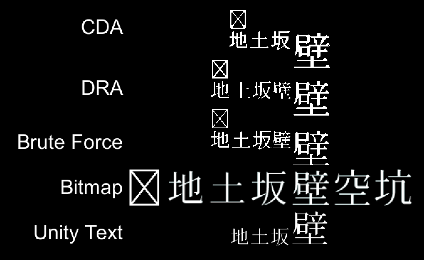
Of the signed distance variants, both dead reckoning and brute force look passible for the larger glyph sizes (approximately 64x64). Note that the bottom of 壁 is thicker in dead reckoning, and there's a small error in the 尸 of 壁 when brute forcing the calculations (click the image to see this better). These larger glyphs were approximately 512x512px for the signed distance calculation input in dead reckoning and brute force. The Chamfer algorithm result used an approximately 64x64px glyph for input for illustration. All three algorithms performed poorly with smaller glyphs.
For now, I'm going to continue using straight bitmaps, as I can directly improve the quality and changing to a signed distance field approach later would be trivial if needed. It's also significantly faster to iterate with actual-size glyphs than computing the signed distance fields on glyphs eight-times larger. But dead reckoning and brute forcing look sharper than the bitmap and Unity text, and this may eventually persuade me to change when I begin polishing the game.